How I built my portfolio website with HUGO
Links
Description
This project was created to showcase my skills and highlghts as a developer. It consists of a main website used as a link in bio-like with all my relevant links and information.
Among those links are the following:
- My blog
- This projects website
- My CV
Also some social media just in case it is easier for someone to contact me directly through them, and my email.
Phases
This project has gone through several phases where I was struggling how to make it both look good and be functional enough for a recruiter to see my work.
Phase 1 - Testing the grounds
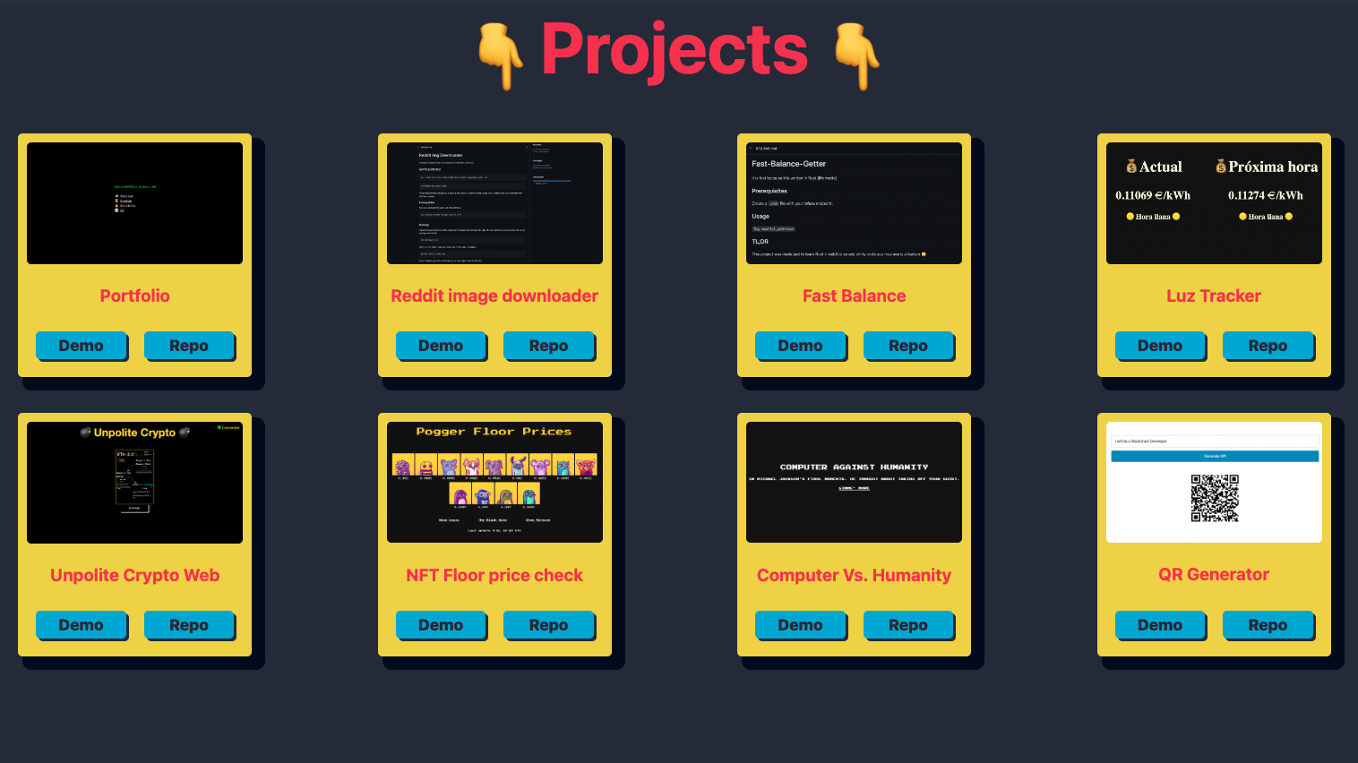
I knew I wanted a website that was simple and easy to use, so I started with the classical grid layout with some photos and links. The style was a bit of a mess 🥴, but I liked the cartoonish style of the cards so I iterated on it a couple of times.
Simple iteration on the color pallate and size of cards so it was more mobile friendly.
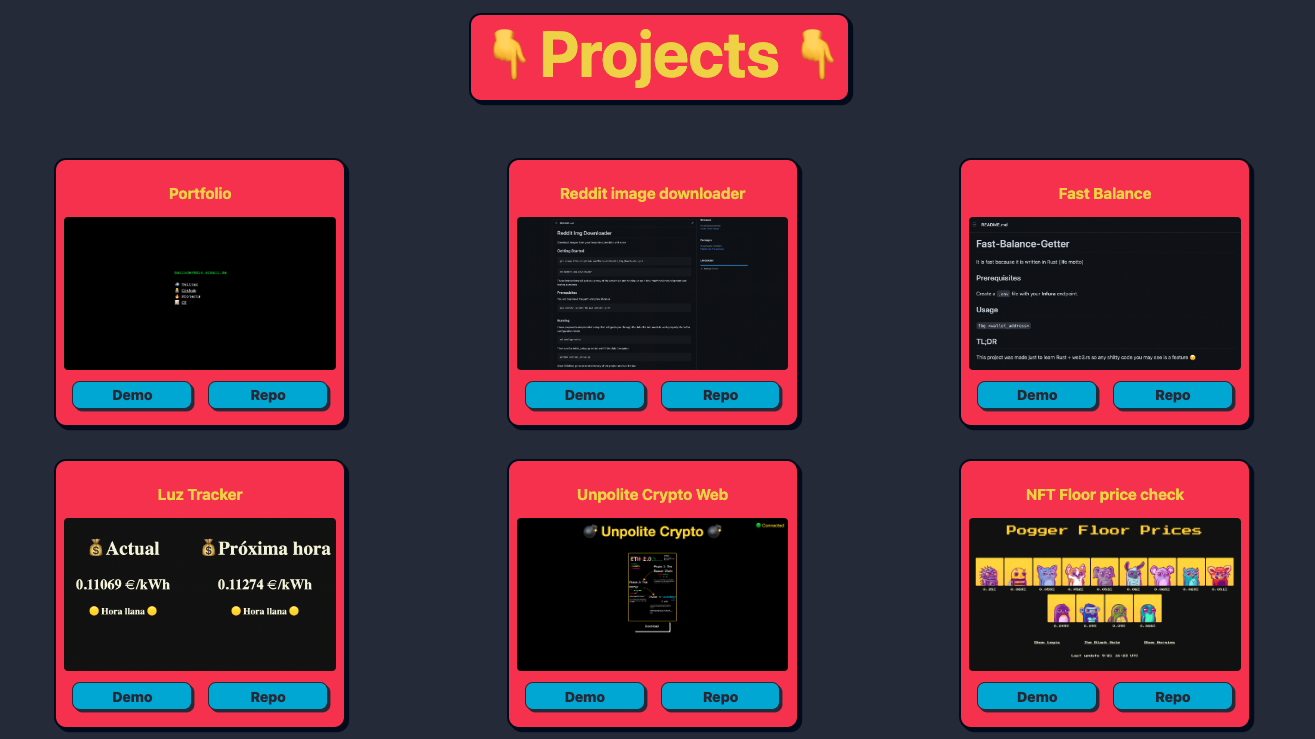
Phase 2 - Mobile friendly + Navigation
More color pallete 🎨 changes and the addition of a navbar. At this point i wasn’t very happy with how it was turning out, so I decided to make it mor like a blog and lees of a simple card layout.
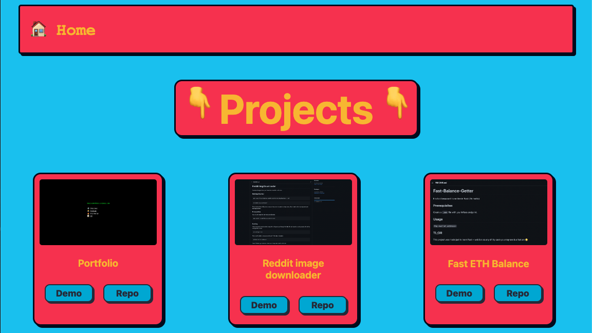
Phase 3 - Complete redesign
And here are we now 🥳. This is the final version of the projects page and I think it was the best decision to make.
This format lets me approach my projects in a way tat I can document them and have a history of my train of thought at the moment of making them.
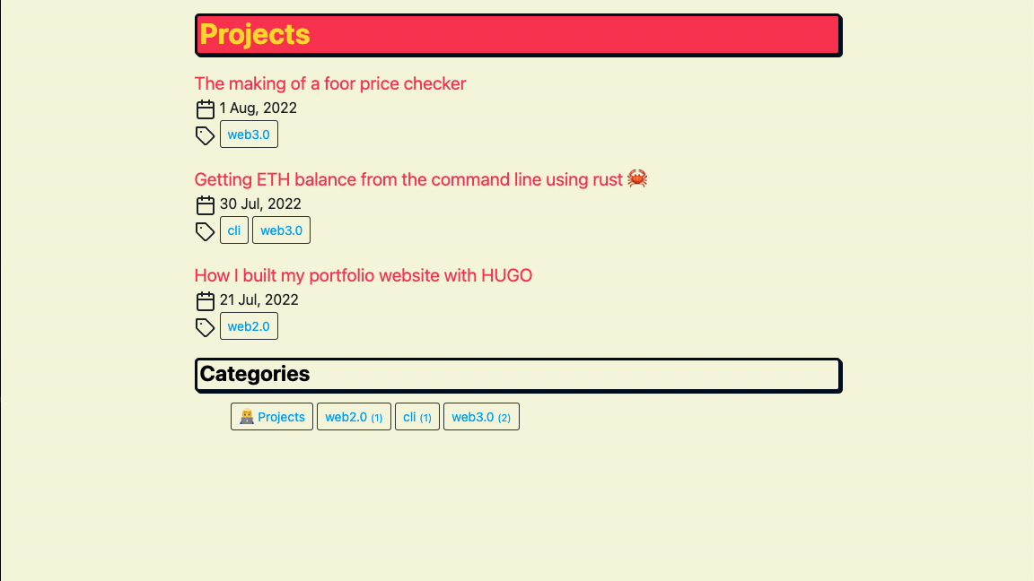
Phase 4 - To the point
Even though this seems like a lot of thinking and rethinking, now comes the most important part, what technology to use.
As I ended up liking much more the blog 📝 style, I decided to use a static site generator called Hugo which is the same one I use on my blog.
I had the design, so it was only a matter of using the same one both in my blog and projects page (the projects page design came before the blog 😅).
Technologies Used
- Hugo 🐭
- HTML 📝
- CSS 🎨
- Git 💻